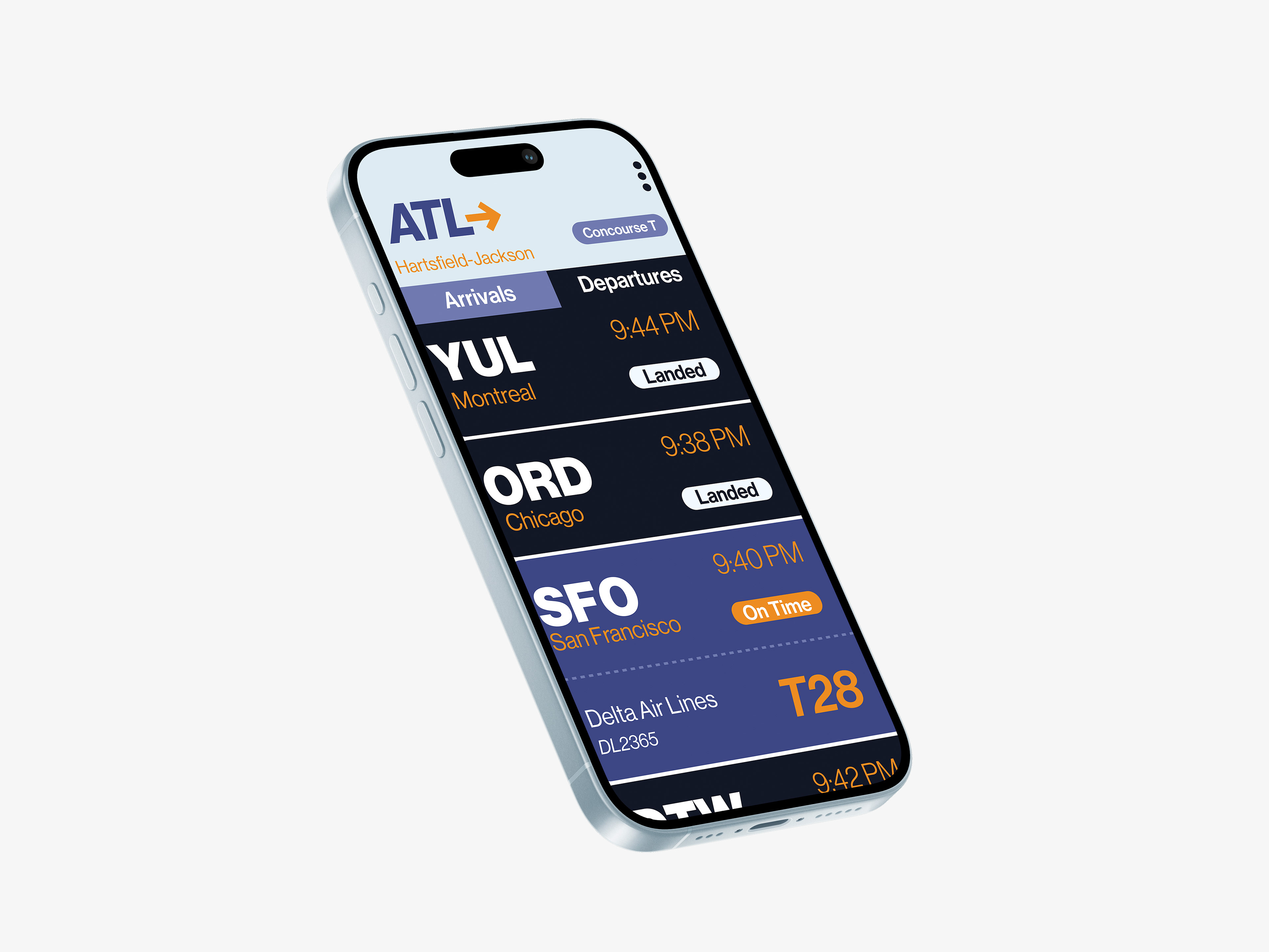
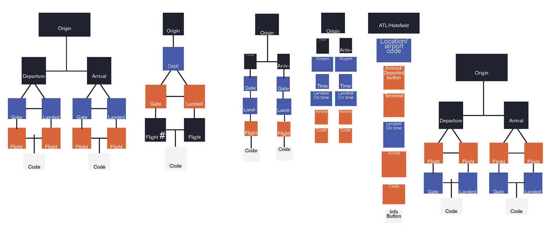
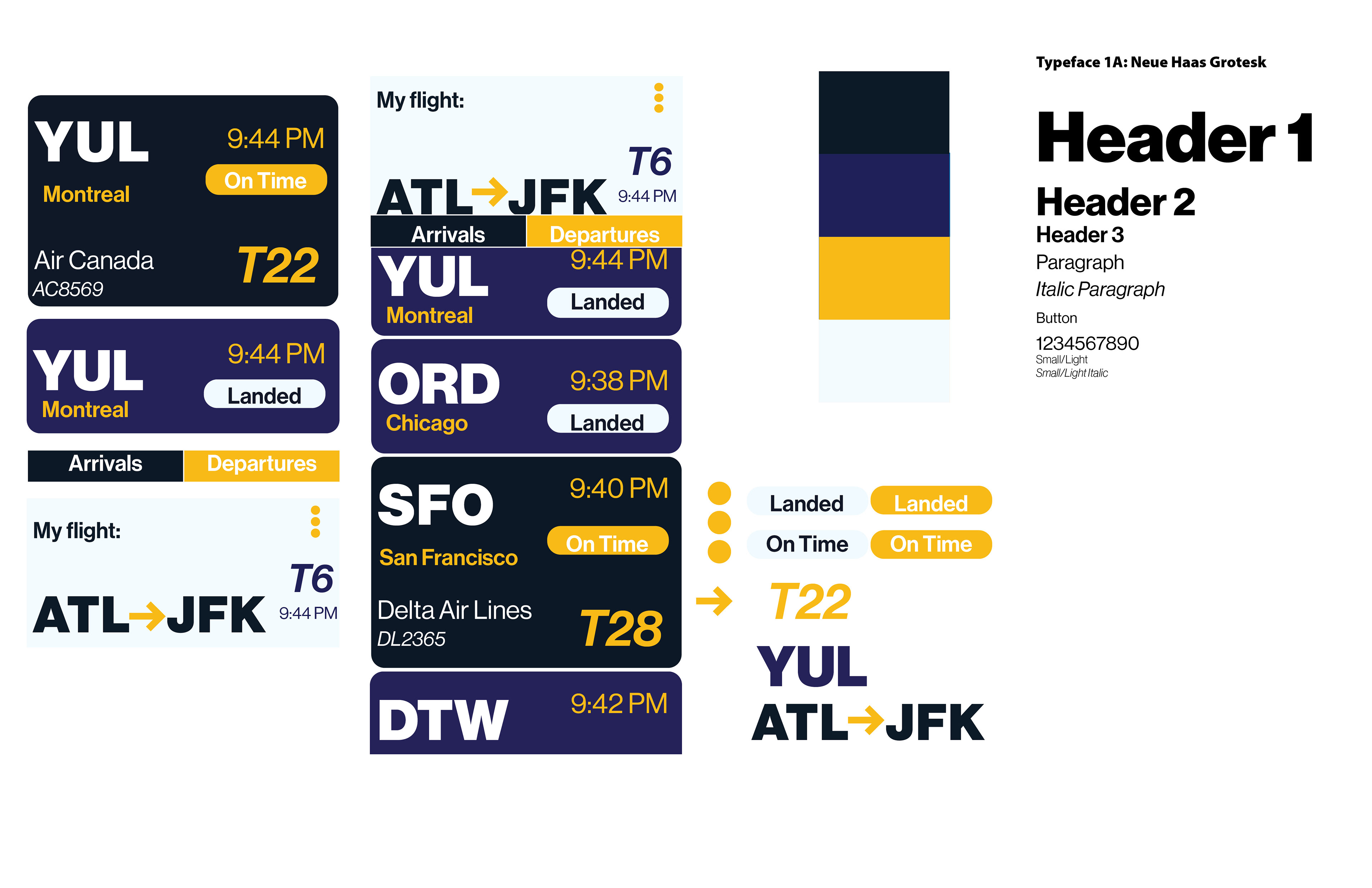
The project's goal was to create a cohesive and visually appealing app interface, while emphasizing visual hierarchy and clear communication. I had to analyze how the colors were viewed, the size of the font, and the general layout to see how an outsider would view the app.
Concepts and interface
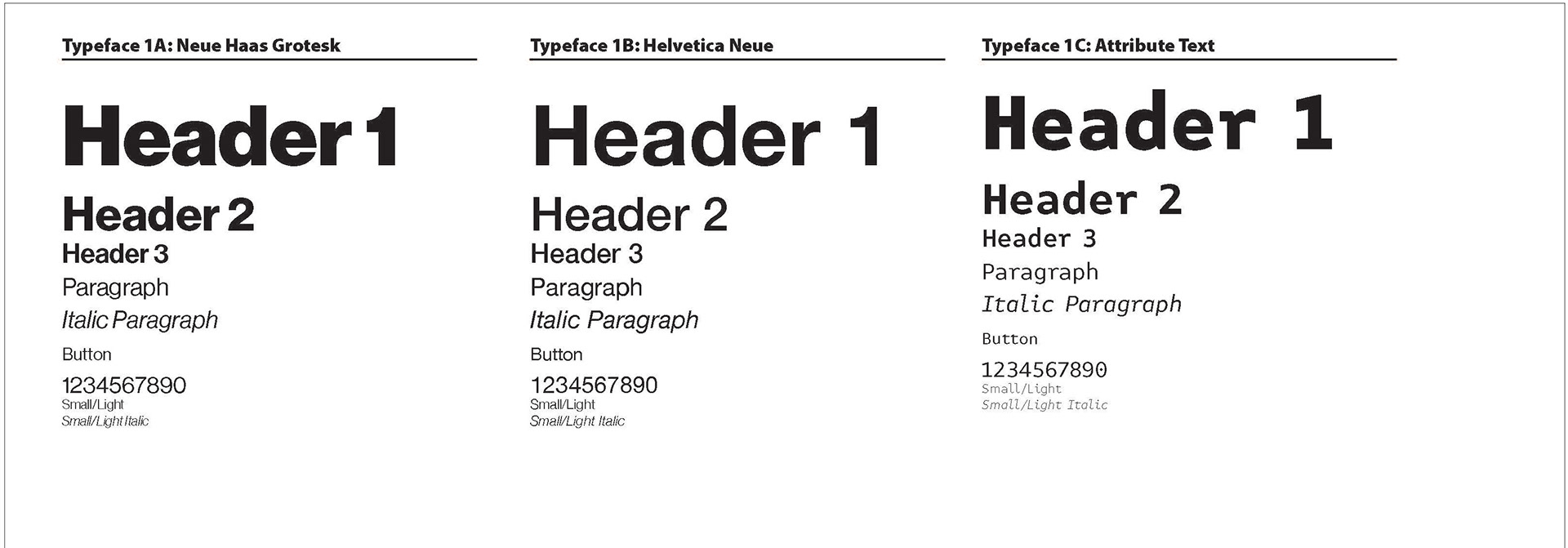
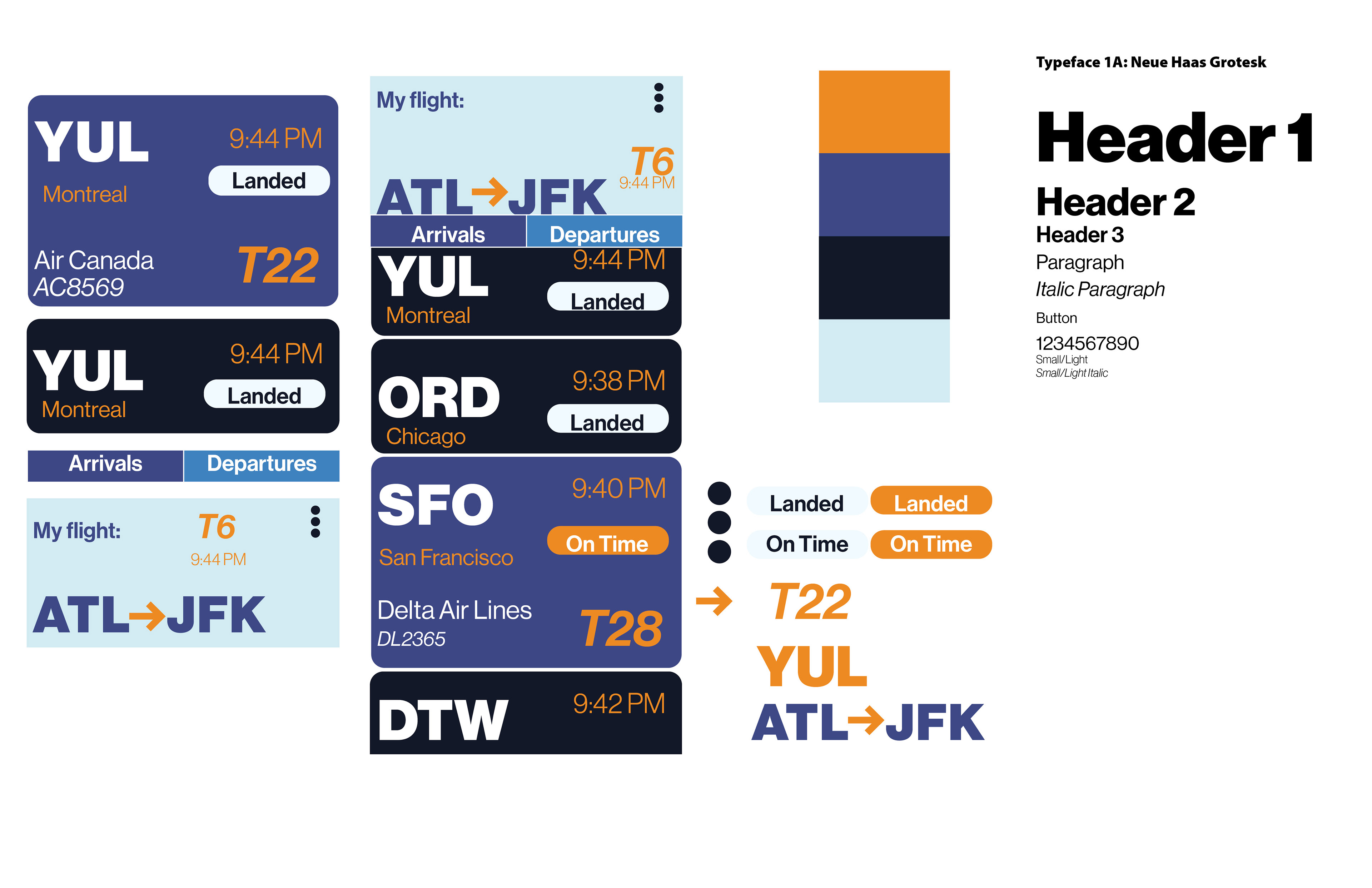
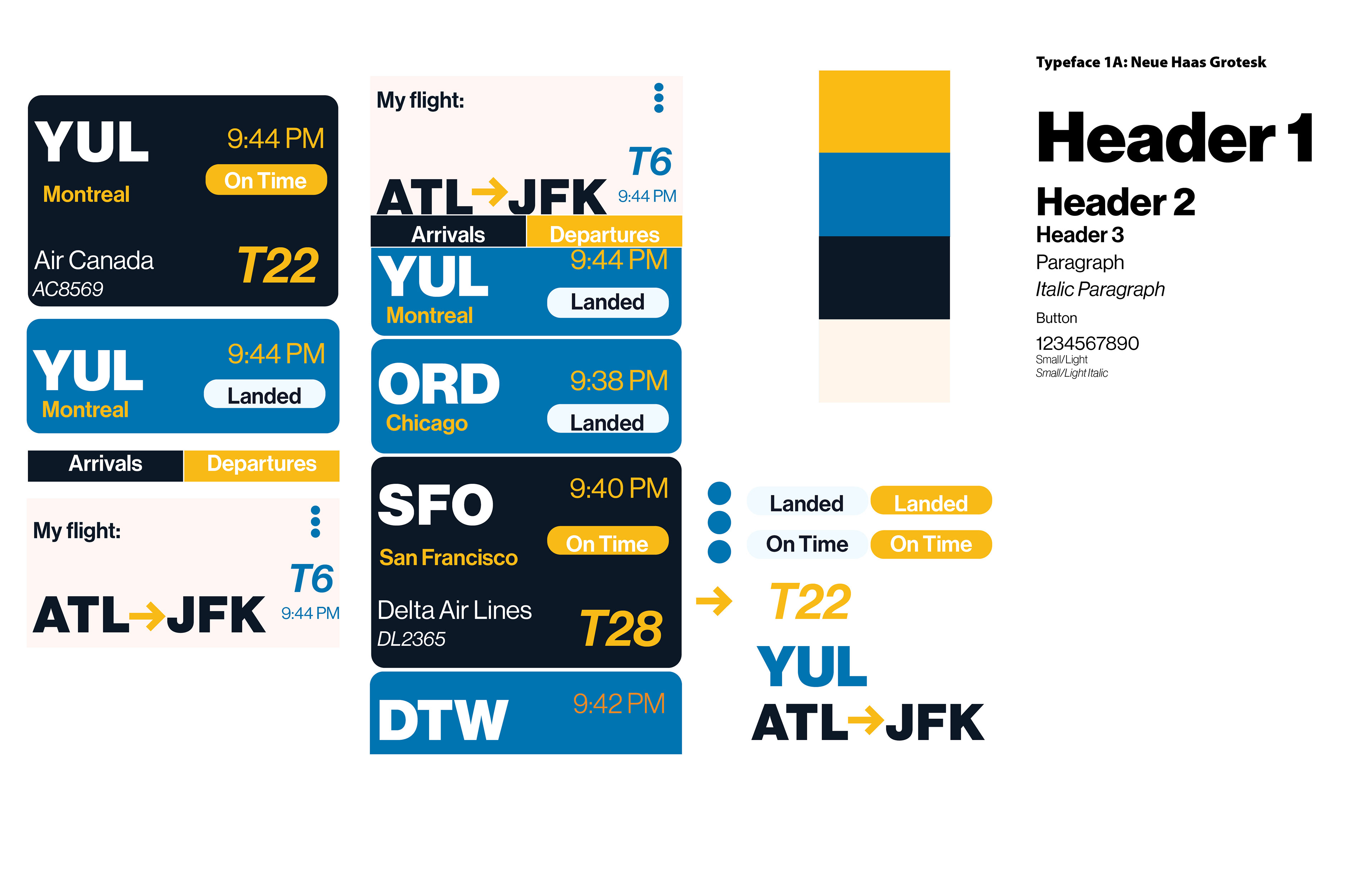
Color, font and hierarchy were all decided through several trials of seeing and testing what outcome looked the best.
FInal Frames
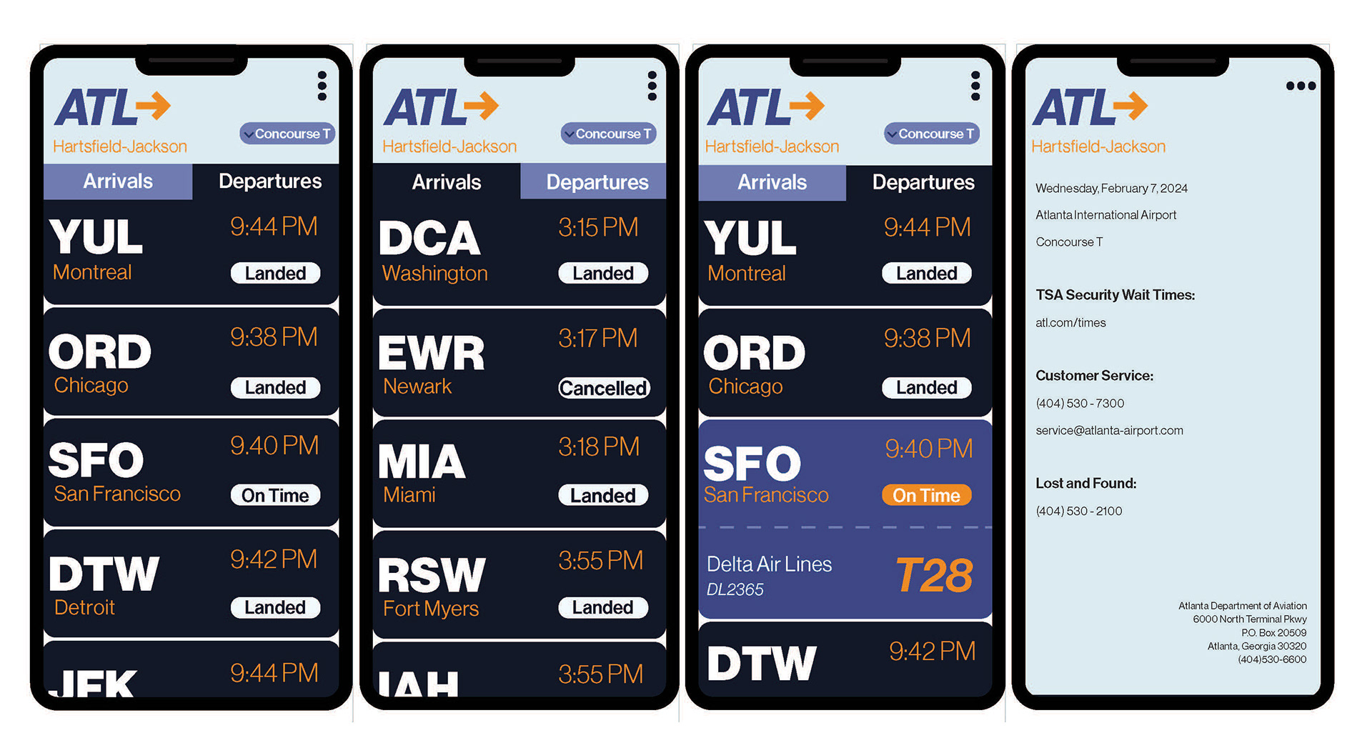
The final product showcases a unique yet practical design. The large font sizes are easily readable to those of all varying eyesights. While doing this project, I really struggled with the fine details, but I am very proud of the final outcome and the practicality and simplicity of it.
Final Video
Final Mockup